WEB DESIGN
Responsive Web Design Agency
Unlock the power of custom responsive web design.
A responsive website isn’t just a luxury — it’s a necessity. Spinutech’s responsive web design services ensure your website looks and performs beautifully across devices, from desktops to smartphones. By combining custom design expertise with data-driven insights, we create websites that seamlessly adapt to any screen size while delivering an exceptional user experience.


RESPONSIVE DESIGN STRATEGY
Responsive design services to elevate your brand
Responsive web design is a strategy that directly impacts how users interact with your brand. By ensuring your site adapts perfectly to any device, responsive design enhances user experience, boosts engagement, and increases time spent on your site.
This translates into more opportunities for brands to convert visitors into customers, improve search engine rankings, and optimize marketing strategies. Whether you’re refining your tactics or building an integrated digital strategy, responsive design is the cornerstone of a modern website.
OUR SERVICES
Spinutech’s custom responsive web design services
We don’t believe in one-size-fits-all. Our design team crafts solutions tailored to your unique needs, ensuring every pixel serves a purpose. With a forward-thinking approach, we use advanced tools and techniques to create responsive designs that not only perform well but also future-proof your website.
Whether you’re undergoing a website redesign or optimizing an existing site, Spinutech’s custom responsive web designs elevate your digital presence, helping you connect with your audience and achieve measurable results.

CROSS-COLLABORATIONS
Responsive web design supports broader strategies
Responsive websites don’t just enhance user experience — they support and amplify other critical services and strategies.
Website Design
A responsive framework ensures consistency across devices, creating a seamless user journey. It allows your brand to maintain a professional and cohesive appearance regardless of screen size.
Website Development
Building responsive sites streamlines the development process, saving time and resources. It consolidates mobile and desktop solutions into a single, efficient system that’s easier to maintain.
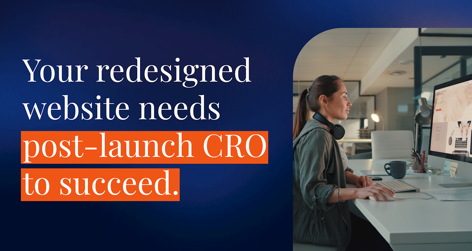
Conversion Rate Optimization (CRO)
Responsive sites reduce friction, making it simpler for users to navigate and take action. This enhanced usability directly supports improved conversion rates and overall site performance.
SEO
Search engines prioritize responsive websites, which improves visibility and rankings. It also ensures your site is optimized for the growing number of mobile users, increasing organic traffic.


WHY SPINUTECH?
Why make Spinutech your responsive web design agency?
Spinutech is more than just a responsive web design company — we’re your strategic partner. With end-to-end development and hosting support, multi-channel expertise, and a team of industry-agnostic experts, we deliver tailored solutions that drive growth. Our experienced designers collaborate closely with your team to ensure your website reflects your brand’s identity while meeting the needs of modern users. By partnering with Spinutech, you’re choosing precision, creativity, and a commitment to your success.
WEB DESIGN TRENDS
Catch up on the latest in website design news and trends

Responsive Web Design FAQs
Frequently Asked Questions
Responsive web design ensures your website adapts seamlessly to different screen sizes and devices, providing an optimal experience for all users.
Responsive design enhances user experience, improves engagement, and boosts SEO rankings. It’s critical for reaching mobile and desktop users alike.
Yes, responsive design can reduce bounce rates, increase time spent on site, and drive conversions by ensuring a seamless user experience across devices.
A responsive website increases audience reach, reduces bounce rates, and improves conversion rates. It ensures your brand delivers a consistent and professional experience, no matter how users access your site.
The easiest way to check is by resizing your browser window—does your site adapt? If not, it’s likely not responsive. You can also test it on multiple devices or use Google’s Mobile-Friendly Test tool.
While both improve mobile usability, responsive design adapts fluidly to any screen size, providing a consistent experience. Mobile-friendly design ensures a site works well on smaller screens but may not adapt seamlessly to different devices.
OUR LOCATIONS
Responsive website design services near you
Spinutech provides responsive web design services to businesses nationwide, ensuring your website looks stunning and functions seamlessly on every device. Our remote capabilities allow us to serve clients wherever they are, combining expertise with a personalized approach. Elevate your website and connect with your audience — wherever they may be.